GB513 Discussion
What is the source that analyzes the misleading statistical claim? (Include a link)
The source that analyzes the misleading statistical claim is an article on Quartz titled “The Chart Tim Cook Doesn’t Want You to See” by David Yanofsky, available at this link: https://qz.com/122921/the-chart-tim-cook-doesnt-want-you-to-see/
What is the source or title of the original misleading claim? (Include a link if available)
The original misleading claim was made by Apple CEO Tim Cook during the 2007 iPhone Announcement Event for the upcoming iPhone 5s. No direct link is available, as it was from a live event presentation.
What is the claim being made? Copy/paste or summarize the claim.
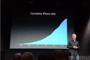
At the 2007 iPhone Announcement Event, Tim Cook presented a graph depicting the cumulative sales of iPhones since their initial launch in 2007. The graph showed vast growth in iPhone sales over time but did not have any information or values on the y-axis of the graph. This made the growth look more significant and impressive than it actually was by omitting key contextual data. The graph looked as follows:
What is the statistical analysis proposed to support this claim? Copy/paste their description of how they arrived at their results.
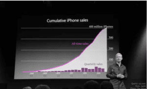
After looking at Apple’s quarterly filings with the Securities and Exchange Commission (SEC), David Yanofsky of Quartz represented the same iPhone sales data more honestly in his article. He included the actual numerical values that the original chart from Tim Cook was missing on the y-axis. This provided the proper context to interpret the growth rate. The graph presented by Yanofsky is as follows (Yanofsky, 2013):
Which type of “Misuse of Statistics” does your example fall under? Why?
This example falls under the category of “Misleading data visualization”. The original chart presented by Tim Cook was misleading because it omitted key information, namely the scale and values on the y-axis. Without this context, the visual of the chart made it appear that iPhone sales growth was more significant than the underlying data supported when shown with the proper y-axis values. Truncating or manipulating the axes is a common way to misrepresent data in visualizations (Calzon, 2023).
What would be a better analysis to evaluate the situation? Describe how to fix the faults in this analysis or suggest a different approach.
A better analysis would be to show the iPhone sales data in a chart that includes clear values on both the x and y-axes, as Yanofsky did in his Quartz article. This provides full context for the audience to properly interpret the scale and rate of growth. Additionally, it may be helpful to plot the sales data as a line graph of units sold per quarter or per year rather than a cumulative total. This would more clearly show if the growth rate is accelerating, decelerating, or remaining steady over time. Moreover, some qualitative context around key events, like new iPhone model launches, could help explain any spikes or dips in the sales trendline. Nonetheless, the most important thing is to present the quantitative data itself in an honest and transparent way, not omitting any key information needed to interpret the visualization accurately.
References
Calzon, B. (2023). Misleading Statistics Examples – Discover The Potential for Misuse of Statistics & Data in The Digital Age. DataPine. https://www.datapine.com/blog/misleading-statistics-and-data/
Yanofsky, D. (2013). The chart Tim Cook doesn’t want you to see. Quartz. https://qz.com/122921/the-chart-tim-cook-doesnt-want-you-to-see/
ORDER A PLAGIARISM-FREE PAPER HERE
We’ll write everything from scratch
Question
GB513 Discussion
This discussion is based on the article “Misleading Statistics Examples – Discover The Potential For Misuse of Statistics & Data In The Digital Age” by Bernardita Calzon (Attached). Make sure to read this article before starting the discussion.

GB513 Discussion
Statistics are a way of summarizing large data sets and making sense of them. Statistical results allow us to make decisions and test our preconceived opinions. While this makes statistics a powerful tool, it also means improper use can lead to misunderstanding data and making incorrect decisions. When people are trying to convince others that their arguments are the correct ones, they will use statistics to support their side. When winning is more important than the truth, they may intentionally present incorrect results and apply methodologies improperly.
The article above discusses some of the ways statistics can be used improperly to mislead other into believing one side against another. The article not only explains some common ways of doing this, but it also gives some real-life examples. Read the article linked above and then answer the discussion topic questions.
For this discussion, find one example where someone is misrepresenting data through improper use of statistics to support their viewpoint. Since identification of misleading statistics use can be difficult and tricky, you must search for a case where a reliable source has identified someone misusing a statistic to mislead. Do not try to identify an example of misuse yourself. You may use articles on statistics oriented websites or fact-checking websites to find your example.
Tips on finding proper examples:
- Prioritize non-political examples. You can search for articles on, or examples of the categories mentioned in the article that is the basis of this discussion. A very popular category is Faulty/misleading data visualization. Some others are Faulty polling, Flawed correlations, Data fishing, Selective bias, Using percentage change in combination with a small sample size. Some topic options include: Nutrition, Health, Drugs, Advertising, Science, and Research.
- Do not use examples from social media. Random people making faulty claims are not appropriate examples, regardless of how popularly circulated they may be.
Tips on responding to the questions:
- Categorize the example you found according to the six categories described in the article. Since the hard work of identifying an attempt to mislead is already done by the analytical source, you will be evaluated on your selection of an example and subsequent analysis of the issue.
- When responding to others, please only discuss whether you think the analysis was indeed misrepresentative or not. Do not discuss the overall claim that is being made and if you disagree with it. We are only concerned about the analysis methods, not the actual assertions made. Misleading statistics are intentionally used to push narratives; we are not here to argue anything but statistics.
Please use the template below in your answers, so everyone can easily follow your answers to all the questions (using the template below is part of the requirements; you will lose points if you do not follow the template or if you skip portions of what is being asked)
What is the source that analyzes the misleading statistical claim? (Include a link)
What is the source or title of the original misleading claim? (Include a link if available)
Note: As noted previously, you must have an independent source analyzing the misleading claim. If you are missing either of the two sources above, you will lose points.
What is the claim being made? Copy/paste or summarize the claim.
If it is a visual (like a chart) then please include the chart in the post. You can usually copy paste images into the post. Include as much of the information here as possible so all readers can see what you are describing without having to visit the link and search for the problem.
What is the statistical analysis proposed to support this claim? Copy/paste their description of how they arrived at their results.
Which type of “Misuse of Statistics” does your example fall under? Why?This is the most important part of the discussion. You demonstrate your understanding of the types of misleading statistics in this section by categorizing based on the various types discussed in the article (Note that this is referring to the nine types of “Misuse of statistics” discussed in the second half of the article, such as “faulty polling”, “flawed correlations”, “data fishing” and so on.) Justify your selection and your identification of the issue.
What would be a better analysis to evaluate the situation? Describe how to fix the faults in this analysis or suggest a different approach.


