Course Project Worksheet – Frequency Tables and Histograms
Complete Parts 1 and 2 below.
Part 1: Frequency Tables
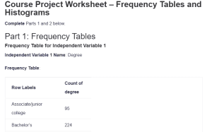
Frequency Table for Independent Variable 1
Independent Variable 1 Name: Degree
Frequency Table:
| Row Labels | Count of degree |
| Associate/junior college | 95 |
| Bachelor’s | 224 |
| Graduate | 116 |
| High school | 563 |
| Less than high school | 109 |
| Grand Total | 1107 |
Summary and Description:
The frequency table presents a comprehensive analysis of educational attainment among 1,107 respondents in the survey. The data reveals a significant concentration at the high school education level, with 50.9% (n=563) of respondents having completed this level of education. This majority suggests a foundational level of educational achievement within the sample population. Bachelor’s degree holders constitute the second-largest group at 20.2% (n=224), indicating a substantial proportion with higher education credentials. Graduate degree holders represent 10.5% (n=116) of the sample, demonstrating advanced academic achievement. Those with associate/junior college degrees make up 8.6% (n=95), while 9.8% (n=109) have less than a high school education. According to Cahalan et al. (2022), this distribution generally mirrors national trends in educational attainment, though with slightly higher representation in the high school completion category than typical national averages. The relatively small percentage of respondents with less than a high school education might suggest increasing accessibility to basic education or potential sampling characteristics.
Frequency Table for Independent Variable 2
Independent Variable 2 Name: Polviews
Frequency Table:
| Row Labels | Count of polviews |
| Conservative | 186 |
| Extremely conservative | 44 |
| Extremely liberal | 54 |
| Liberal | 129 |
| Moderate, middle of the road | 417 |
| Slightly conservative | 143 |
| Slightly liberal | 134 |
| Grand Total | 1107 |
Summary and Description:
The frequency distribution of political views among the 1,107 respondents showcases the complex ideological landscape of the sample population. The predominant category is “Moderate, middle of the road” at 37.7% (n=417), suggesting a significant centrist orientation within the sample. Conservative viewpoints show interesting gradation, with 16.8% (n=186) identifying as Conservative, 12.9% (n=143) as Slightly conservative, and 4% (n=44) as Extremely conservative. Similarly, on the liberal spectrum, 11.7% (n=129) identify as Liberal, 12.1% (n=134) as Slightly liberal, and 4.9% (n=54) as Extremely liberal. Wilson et al. (2020) note that this pattern of ideological distribution, with strong moderate representation and declining numbers toward the extremes, is characteristic of contemporary political alignment patterns. The relatively small proportions at the extreme ends of the spectrum (Extremely conservative and Extremely liberal) suggest that most respondents tend to avoid identifying with more radical political positions, preferring more moderate stances.
Frequency Table for Dependent Variable
Dependent Variable Name: Natheal
Frequency Table:
| Row Labels | Count of natheal |
| ABOUT RIGHT | 240 |
| TOO LITTLE | 812 |
| TOO MUCH | 55 |
| Grand Total | 1107 |
Summary and Description:
The frequency distribution for attitudes toward healthcare spending presents a striking pattern among the 1,107 respondents, revealing strong public sentiment regarding healthcare resource allocation. An overwhelming majority of 73.4% (n=812) believe that “TOO LITTLE” is being spent on healthcare, indicating a robust public consensus for increased healthcare funding. This substantial majority suggests widespread dissatisfaction with current healthcare spending levels across the sample population. The second largest group, comprising 21.7% (n=240) of respondents, considers current spending levels “ABOUT RIGHT,” representing a smaller but significant segment satisfied with existing healthcare expenditure. Notably, only a very small minority of 5% (n=55) believes “TOO MUCH” is being spent on healthcare. The stark imbalance in these responses, with nearly three-quarters of respondents favoring increased spending, points to a clear public mandate for healthcare funding enhancement. This distribution could reflect growing public awareness of healthcare system challenges, increasing healthcare costs, or broader concerns about healthcare accessibility and quality in the current system.
Part 2: Histograms and Graphs
Histogram for Independent Variable 1
Independent Variable 1 Name: Degree
Histogram:
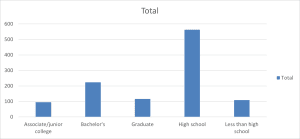
Summary and Description:
The histogram displays the distribution of educational attainment across five distinct categories among 1,107 respondents. The data visualization reveals a pronounced right-skewed distribution with a dominant peak at the high school education level (n=563), which towers significantly above other educational categories. Bachelor’s degree holders represent the second-highest frequency (n=224), creating a notable secondary peak in the distribution. Graduate degree holders (n=116) and those with less than high school education (n=109) show similar frequencies, while associate/junior college degree holders represent the smallest group (n=95). The stark elevation of the high school category, combined with the gradual decline in frequency for both higher and lower educational levels, creates an asymmetrical distribution pattern.
Histogram for Independent Variable 2
Independent Variable 2 Name: Polviews
Histogram:
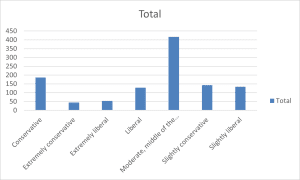
Summary and Description:
The histogram illustrates the distribution of political views among 1,107 respondents, revealing a distinctive bell-shaped pattern with a pronounced central peak. The data shows “Moderate, middle of the road” as the dominant category with approximately 417 respondents, creating a clear central tendency in the distribution. This peak is flanked by relatively symmetrical distributions on both the conservative and liberal sides of the spectrum. Moving from the center, the frequencies gradually decrease toward the extremes, with “Slightly conservative” (n=143) and “Slightly liberal” (n=134) showing similar frequencies, followed by “Conservative” (n=186) and “Liberal” (n=129) maintaining comparable levels. The extremes of the political spectrum show the lowest frequencies, with “Extremely conservative” (n=44) and “Extremely liberal” (n=54) representing the smallest groups.
Histogram for Dependent Variable
Dependent Variable Name: Natheal
Histogram:
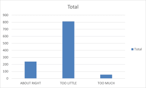
Summary and Description:
The histogram depicting attitudes toward healthcare spending among 1,107 respondents reveals a dramatically skewed distribution with a dominant preference for increased healthcare spending. The visualization shows an overwhelming majority of respondents (n=812) believing “TOO LITTLE” is being spent on healthcare, creating a pronounced peak that dwarfs the other response categories. This striking imbalance suggests a strong consensus among respondents regarding the inadequacy of current healthcare spending levels. The second category, “ABOUT RIGHT” (n=240), shows substantially lower frequency, representing just over a quarter of the peak category. Most notably, the “TOO MUCH” category shows minimal representation (n=55), creating a sharp negative skew in the distribution. Larsen (2020) notes such strongly skewed distributions in healthcare policy preferences often indicate significant public concern about healthcare resource allocation and accessibility. The dramatic disparity between those believing too little is spent versus too much suggests a clear public mandate for increased healthcare funding, potentially reflecting broader societal concerns about healthcare affordability and access. The minimal support for reduced spending, combined with the modest satisfaction with current levels, creates a distribution pattern that strongly favors policy initiatives supporting expanded healthcare investment.
References
Cahalan, M. W., Addison, M., Brunt, N., Patel, P. R., Vaughan, T., Genao, A., & Perna, L. W. (2022). Indicators of Higher Education Equity in the United States: 2022 Historical Trend Report. In ERIC. Pell Institute for the Study of Opportunity in Higher Education. https://eric.ed.gov/?id=ED620557
Larsen, E. G. (2020). Personal politics? Healthcare policies, personal experiences and government attitudes. Journal of European Social Policy, 095892872090431. https://doi.org/10.1177/0958928720904319
Wilson, A. E., Parker, V. A., & Feinberg, M. (2020). Polarization in the contemporary political and media landscape. Current Opinion in Behavioral Sciences, 34(2352-1546), 223–228. https://doi.org/10.1016/j.cobeha.2020.07.005
ORDER A PLAGIARISM-FREE PAPER HERE
We’ll write everything from scratch
Question 
Complete Parts 1 and 2 below.
Part 1: Frequency Tables
Using your dataset chosen in Week 1, use Excel to complete frequency data runs for each of your variables. Then, describe each frequency table directly referencing the data in the table.
Paste your frequency tables in the appropriate sections below. Be sure to follow proper APA guidelines for each table and describe the results. Each frequency table should be described in about a paragraph and should directly reference the table.
Frequency Table for Independent Variable 1
Independent Variable 1 Name: [Enter independent variable 1 here.]
Frequency Table:
[Paste your frequency table here.]
Summary and Description:
[Enter your summary and description here.]
Frequency Table for Independent Variable 2
Independent Variable 2 Name: [Enter independent variable 2 here.]
Frequency Table:
[Paste your frequency table here.]
Summary and Description:
[Enter your summary and description here.]
Frequency Table for Dependent Variable
Dependent Variable Name: [Enter dependent variable here.]
Frequency Table:
[Paste your frequency table here.]
Summary and Description:
[Enter your summary and description here.]
Part 2: Histograms and Graphs
Using the same data you selected in Week 1, develop a histogram and assess the distribution of each variable. Consider why the distribution of the data is important.
Paste your histograms in the appropriate sections below. Be sure to follow proper APA guidelines for each histogram and describe the results. Each histogram should be described in about a paragraph and should directly reference the histogram.
Course Project Worksheet – Frequency Tables and Histograms
Histogram for Independent Variable 1
Independent Variable 1 Name: [Enter independent variable 1 here.]
Histogram:
[Paste your histogram here.]
Summary and Description:
[Enter your summary and description here.]
Histogram for Independent Variable 2
Independent Variable 2 Name: [Enter independent variable 2 here.]
Histogram:
[Paste your histogram here.]
Summary and Description:
[Enter your summary and description here.]
Histogram for Dependent Variable
Dependent Variable Name: [Enter dependent variable here.]
Histogram:
[Paste your histogram here.]
Summary and Description:
[Enter your summary and description here.]
References
[List references for Part 1 and 2 according to APA guidelines.]