Data Analysis – Cost of Goods Sold (COGS)
Data analysis is essential for evaluating the success of new product launches because it hints at how costs, revenue, and profit trends are coming (Meeker et al., 2021). Systematic review of financial data allows an assessment of performance relative to patterns and thus quickly and effectively makes business decisions. This study considers how the company manages to achieve its target profit margin of 25% of the cost of goods sold (COGS) and discusses that portion of COGS (25%). This data can be studied to answer the questions regarding the financial health of the product. In particular, this analysis will evaluate variations in COGS for a month by month, profit trends as reflected over time, and fluctuation in profit as a percentage of COGS.
Furthermore, this paper will determine factors that cause variations in revenue and profit. This helps decide whether the product launch was successful and serves as a base for future financial strategies. Therefore, to improve the analysis, key trends will be depicted through charts and graphs, making it more straightforward to interpret cost and profit dynamics (Bell et al., 2022). Notably, this is a helpful internal report for making decisions while applying pricing strategies, properly utilizing costs, and increasing profitability in general.
Analysis and Findings
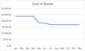
The cost of goods sold (COGS) fluctuated widely throughout the year and showed efficient cost management. From January to April, COGS stayed at $23,920 a month. Labor and overhead costs were mainly reduced from $35,287 to $18,460 during May and June. From July onwards, the momentum was downward, reaching $17,095, so it is possible there were additional cost optimizations. The role of these reductions was of great value in maintaining profitability and operational efficiency.
Figure 1
Cost of Goods Graph
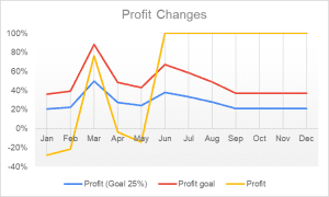
Changes in COGS were reflected in profit trends, with a 25% margin always maintained. In the first four months of the year, that profit was at $5,980 per month. A decrease in COGS has corresponded with a decline in this figure for May and June, falling to $4,615. Profit further took a hit from July to December, with a loss of $4,273.75 due to continued cost-cutting. Though the sum of the absolute profit values dropped, the magnitude of the proportional profit margin showed that financial planning and sustainability were taking place effectively.
Figure 2
Profit Changes Graph
The main objective to launch the product was to make a profit equivalent to 25% of COGS. The analysis confirms this goal, which is to be achieved every month. Despite variations in cost and profit figures, the company achieved the intended profitability ratio. A business that is financially viable throughout the year is an accomplishment proven by strong cost-control measures and a managed pricing strategy. Several variables affected the changes in revenue and profit over time. Variations in labor and overhead costs had a significant impact. However, in May, the reduction in labor expenses resulted in a reduction in the cost of goods sold and profit as a sign of starting a cost optimization strategy. However, operating expenses began to be further fine-tuned in July for a lower cost base and continued profitability. Nonetheless, knowing the influencing factors will help in future decision-making and cost-control strategies.
The financial data, therefore, implies that the product (or alliance) launch was competently executed and that the profit from delivering the product (alliance) matched the company’s goals. Effective cost management means sustaining a 25% profit margin and decreasing COGS. A future strategy could be to achieve lower COGS and higher revenue to increase absolute profit values. Therefore, the company can continue to monitor these financial trends, ensuring success and adaptability in a changing market.
The Type Graph Used and Rationale for Its Selection
The chart used is a line graph displaying the trend in cost of goods sold, revenue, and profit over time. This chart helps in pattern identification, like the reduction of expenses, stable profit, and financial performance fluctuations (Wang et al., 2017). As a result, this helps one gain clear insight from the product launch on whether it is successful and sustainable altogether.
Conclusion
This analysis evaluated the new product launch’s financial performance in cost, revenue, and profit. Using the cost of goods sold and profit margins, this analysis studied these aspects in time to find out whether the company achieved its target of a profit margin of 25% of COGS. Accordingly, the evaluation found that the company achieved this target throughout the year. Initially, COGS stayed stable, but reducing labor and overhead generally brought down expenses, keeping the company profitable. Even though relative profit values declined, the relative margin was maintained, implied by effective cost control. Line graphs helped in identifying the financial trend line and determining whether there were any turning points in cost reduction or income stability. Using the visual tools helped to confirm that strategic cost management was key to sustaining profitability and a successful product launch.
References
Bell, E., Harley, B., & Bryman, A. (2022). Business research methods. Oxford University Press.
Meeker, W. Q., Escobar, L. A., & Pascual, F. G. (2021). Statistical methods for reliability data. John Wiley & Sons.
Wang, Y., Han, F., Zhu, L., Deussen, O., & Chen, B. (2017). Line graph or scatter plot? Automatic selection of methods for visualizing trends in time series. IEEE Transactions on Visualization and Computer Graphics, 24(2), 1141–1154. https://doi.org/10.1109/tvcg.2017.2653106
ORDER A PLAGIARISM-FREE PAPER HERE
We’ll write everything from scratch
Question 
Data Analysis – Cost of Goods Sold (COGS)
Overview
To make sense of all the data available to them, business leaders work alongside data scientists who generate data visualizations to understand business questions via analytics. This process gives companies insight on what is working and what is not: for example, whether the products or services offered are meeting expectations, or if a shift in strategy is necessary.
Data Analysis – Cost of Goods Sold (COGS)
Prompt
For this assignment, you will take on the role of a business leader who wishes to analyze if a new product their company has introduced is meeting the expectations. Imagine that you would like to create a post in the company intranet that summarizes your findings in an easy-to-read format for your team. Pay special attention to creating meaningful data visualizations. You should use techniques that make content easy to follow but that also display charts accurately without distorting or skewing data. Your company’s profit goal is 25% of the cost of goods sold (COGS). Remember, COGS is the cost of manufacturing the product, including labor, materials, and overhead. You will need to build trust and an open channel of communication with other leaders on your team. Pay close attention to the story that data visualizations tell you and others reviewing your post.
The purpose of this analysis is to better understand the cost, revenue, and profit associated with the new product launch. Review the Cost, Revenue, and Profit Spreadsheet retrieved from the company’s data center and consider the following while developing your ideas in this assignment.
- What is the importance of data analysis?
- What are the results of your analysis?
- Think about your analysis and its findings, including visuals. Use visuals and text to re-state the purpose of your analysis and summarize your most important findings.
- What are you trying to represent with this data?
- What kind of graphic have you selected and why?
- How did adding visual representations of the data change your analysis?
- Does the target audience influence the way you display information?
- sources should be cited according to APA style. Your assignment must be between 400 and 800 words in length.
As you review the data, look for answers to the following questions:
How does the cost of goods sold (COGS) change from month to month?
How does the profit change over time?
How has the profit as a percentage of the COGS changed over time?
What factors are responsible for changes in revenue and profit?
Has your company been able to meet its goal of a profit equal to 25 percent of the COGS?
You’ll also want to experiment with the spreadsheet and the data to find the charts or graphs that best allow you to visualize important trends. Remember, the purpose of this analysis is to better understand the cost, revenue, and profit associated with the new product launch.
To begin your report, write a brief introduction explaining the importance of data analysis and how it is essential for understanding how well a product is performing.
As you write, remember that you are creating an internal report for your coworkers.
What is the importance of data analysis? How can it help you understand whether the new product had a successful launch? What are you reporting on and what are you analyzing? Why is it important to analyze this information? Your response should be between 100–200 words.
Now that you’ve introduced your post by explaining the importance of data analysis, you can move on to reporting on your findings. Based on your analysis of the product launch data, provide a general overview of the data and describe the story of the product launch that emerges from your analysis of it.
Describe the results of your analysis. What does the data tell you about the success of the product throughout the year? Was the company able to meet its profit goal? What data did you use to determine whether the product is meeting expectations? Your response should be between 200–300 words.
ou’ve introduced your post by explaining the importance of data analysis, and you’ve told the story of your product’s launch. Now it’s time to summarize your most important findings with data visualizations to help employees and fellow company leaders understand your insights about the product launch data.
Consider creating data visualizations that illustrate the following information:
How have the costs of goods sold (COGS) changed over the course of the year?
How has the profit percentage changed over the course of the year?
Keep your target audience in mind as you choose which data visualizations to use. Look for visualizations that best highlight the most useful information in a way that will be easiest for your coworkers to interpret.
This one needs two – Explain what type of chart this is and the insights it provides about the success of the product launch. Your response should be between 30–50 words.
To conclude your report, use the template below to summarize the purpose of your analysis and explain your most important findings.
Restate the purpose of your analysis and summarize your most important findings. Be sure to highlight what you learned from the data visualizations you created. Your response should be between 100–150 words.