Discussion – Developing Visualizations for Your Story
Total Revenue per Month Presentation
| Jan | Feb | March | April | |
| Total – Boldo Tea | 544 | 600 | 140 | 440 |
| Total – Carne Assada | 1500 | 2362.5 | 7100 | 4987.5 |
| Total – Chocolade | 744.6 | 162.56 | 68.85 | 306 |
| Total – Empanada | 1768.41 | 1978 | 4412.32 | 1656 |
| Total – Guava Bar | 2667.6 | 4013.1 | 4836 | 6087.9 |
| Total – Queso Fresco | 3182.4 | 4683.5 | 9579.5 | 3060 |
| Total – Sopapillas | 25127.36 | 12806.1 | 7312.12 | 3952.5 |
Figure 1
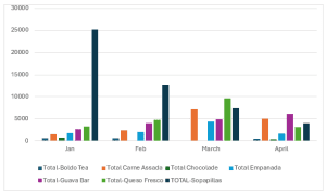
The visual representation of the data has made it easier to identify several things that could have been otherwise hard to identify. A table that provides the total sales for each month is provided. The table offers an insight into the numerical amounts for each food item offered by the restaurant. It is possible to compare the performance of each food item per month. Additionally, a graphic drawn from the data in the table is used to visualize the revenue generated from selling the food items. Notably, this graphic representation makes it easier to identify the product that performs better. For example, Sopapillas performed far more than others in the first two months. However, the revenue generated from the food items reduced significantly in the last two months. Essentially, this provides an insight that the graphic provided makes it easier to observe trends in performance for each product. It is from these observations that informed decisions can be made.
Evidently, I selected a table and a graph as my means to communicate the data for food items. The selection of this graphic is influenced by how easily I was able to identify trends in the performance of the food items regarding revenue generation. According to Yau (2024), graphic visualizations save time for executives when faced with decision-making. Essentially, this was the case for me when selecting the graphics. The graphics can be changed based on various audience groups. For instance, bar graphs could not be appropriate for individuals with color-blindness. Thus, a different graph design, such as line curves, could be adopted.
Reference
Yau, N. (2024). Visualize this: The flowingdata guide to design, visualization, and statistics. John Wiley & Sons.
ORDER A PLAGIARISM-FREE PAPER HERE
We’ll write everything from scratch
Question 
Key building blocks of good decision making include the ability to visualize, analyze, and verbally communicate ideas effectively. Large volumes of data can be particularly complex to understand and present. However, if data is visually presented through a combination of meaningful charts, text, and a verbal narrative, the intended audience can better engage in the discussion of the facts, patterns, and findings that must be acknowledged before moving to the decision-making stage.
Discussion – Developing Visualizations for Your Story
In this discussion, you will take on the role of a new restaurant owner who is checking on sales since the opening of your establishment in January. You have just downloaded the following sales data from your financial software: Module Four Discussion Sales Data Spreadsheet . It includes sales by food item for each month you have been in business. You would like to create visualizations that illustrate which items are selling well and how the business is doing month by month.
In your initial post, make sure to include the visualizations you create and address the following:
- What have you been able to identify through the visual representation of the data?
- What kind of graphic have you selected and why?
- How would this visualization need to be changed based on your audience?