Data Visualization
Task 11
The selected figures for this task are Figure 3: Playfair Bar Graph and Figure 5—map of the United States in 1804. The figure is a bar graph showing the exports and imports of Scotland to and from different parts for a whole year, while the second figure is a map of the United States based on territories in the year 1804 (Wood & Bolch, 2018). Comparing Figure 3 with Tufte’s list of graphical excellence qualities meets all the criteria. First, the image shows data, which is the exports and imports. Secondly, it makes the reader think about what the graph is about, given the distribution of the chart over time. Thirdly, the chart does not distort what the day may have to say since the distribution seems even while encouraging one to compare the data for the different regions. The chart also presents a lot of numbers within a small space since the data presented is for a whole year. The data sets are understandable since the length of the bars varies, showing differences in exports and imports. The graph also reveals data at different levels of detail while serving the purpose of description. Lastly, the chart closely integrates with statistical and verbal descriptions of a data set since it aims to present data collected over a certain period. On the other hand, Figure 5 fails to meet several qualities in Tufte’s list of graphical excellence. The only attributes that the figure satisfies include encouraging the eye to compare different pieces of data given the different colours used and serving a clear purpose of description.
Do you need an original copy of “Data Visualization” ? Get in touch with us.
Task 13
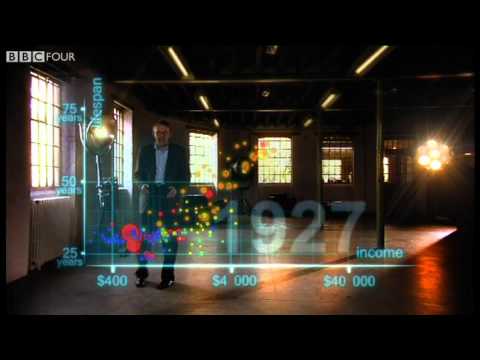
The country selected for this task is India from the Asian continent. When the dynamic data includes all the nations, the life expectancy and wealth were below 40 years for nearly all the nations during the 1800s. All of the countries are with level 1 income. As the chart moves towards the 1900s, life expectancy and wealth increase gradually, with a few countries having a life expectancy of between 50 and 60 years. A majority of the countries have a life expectancy of just above 30 years. A few countries have, at this point, reached level 3 income. By 1950, most of the countries had a life expectancy of more than 50 years, with wealth distribution more even and increasing. By the start of the 21st century, almost all countries, except a few countries, have a life expectancy of more than 60 years and level 2 income. In the present day, nearly all countries have a life expectancy of more than 60 years and at least level 2 income. Studies suggest that life expectancy increases with increased wealth (Kinge et al., 2019). Life expectancy for countries with level 3 and level 4 income is higher than the countries with level 1 and level 2 income.
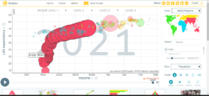
India somehow fits into the story described above. Similar to the other countries, India’s life expectancy during the 1800s is below. The country also has level 1 income. As the chart progresses to the 1900s, India’s life expectancy and wealth also increase significantly slower than the other countries. By 1950, India, similar to other countries, attained a life expectancy of more than 50 years but remained at level 1 income. As of 2000, India achieved a life expectancy of more than 60 years and a level 2 income. In the present day, India has a life expectancy of more than 70 years and a level 2 income. Therefore, India fits into the story of all the countries for about 200 years. The following is the screenshot of the final year in India’s story.

References
Kinge, J. M., Modalsli, J. H., Øverland, S., Gjessing, H. K., Tollånes, M. C., Knudsen, A. K., Skirbekk, V., Strand, B. H., Håberg, S. E., & Vollset, S. E. (2019). Association of Household Income With Life Expectancy and Cause-Specific Mortality in Norway, 2005-2015. JAMA, 321(19), 1916. https://doi.org/10.1001/jama.2019.4329
Wood, B., & Bolch, C. (2018). Seeing and Understanding Data. Probability and Statistics, 2. https://digitalcommons.ursinus.edu/triumphs_statistics/2
ORDER A PLAGIARISM-FREE PAPER HERE
We’ll write everything from scratch
Question 
Data visualization has taken many forms, significantly aided by access to computers and cell phones. However, some basic concepts remain in developing effective data visualization. This assignment builds on Module 4 – Keeping It Real Discussion: What’s Up with Data Visualization? that focuses on Tufte’s list of graphical excellence qualities.

Data Visualization
Read, Watch, & Complete
To continue learning about data visualization, read sections 5 and 6 of Seeing & Understanding Data (PDF). Download Seeing & Understanding Data (PDF). Also, watch this video.
Hans Rosling’s 200 Countries, 200 Years, 4 Minutes – the Joy of Stats (YouTube 4:47) (Links to an external site.)
Complete the following for this assignment. Tasks 11, 12, and 13 are located in the Seeing and Understanding document.
Select and complete either task 11 or 12.
Complete task 13.
Re-play Rosling’s visualization at your speed.
Explore the data for a single country by selecting it in the rightmost column.
Write a paragraph about the story of the world when the dynamic data includes all countries and another section about how the country you watched fits or deviates from that story.
Give a careful description of the story told by the animation for all 200 countries and how the story of just a single country fits into the larger world picture.
Include a screenshot of the final year in that single-country story.
Use current APA formatting to cite your sources.
